
Delivery Hero is a multinational online food ordering and delivery platform that operates in 70+ countries and partners with 500,000+ restaurants.
The Restaurant Vendor Portal is an online one-stop shop where restaurant, business owners can track orders, analyze sales data, get insights, grow with marketing tools, and more.
The impact of the improvements on the Order and Dashboard pages after 3 months of implementation
Increase on the CSAT Score when it comes to billing and payments related
Decrease in the volume of negative tickets related to payment complaints
Increase adoption rate for Payments Page
Disclaimer: All views expressed here are my own and do not necessarily reflect the views of the respective company. Some design elements have been changed from the original.

How might we...
As the sole designer in the Vendor Portal Reporting & Insight Squad, I tackled challenges in dashboards, data, financials, and billing. I collaborated with a UX researcher, partnered with two PMs on problem analysis, solution ideation, and scope prioritization, and worked with engineers and developers to evaluate designs, ensuring clarity and consistency in the financial experience.
— 01. Order-Level Financial Clarity
❌ Problem
Vendors struggle with inaccurate sales and earnings visibility. There's no way to view detailed financial data (sales, cost, commission) per order or identify orders with issues until an invoice is issued.
🟢 Solution
A comprehensive order table with "Estimated Earnings", showing value, commission, and deductions per order to prevent payout surprises. Vendors can also quickly identify orders with issues using filter options.


Order page - Before vs After

Order Timeline Revised
— 02. Sale-Performance Financial Clarity
❌ Problem
Vendors have noticed significant discrepancies between the sale amounts displayed across the platforms (portal app, invoice, POS) and the actual earnings they received.
🟢 Solution
Standardize sales value calculations across platforms for consistency. Add "Estimated Earnings" to key reports, providing vendors with clear payout expectations and reducing support inquiries.
— 03. Payment-Level Financial Clarity
❌ Problem
F&B vendors struggle to consolidate sales and profits across outlets and time periods. While street food vendors face uncertainty due to unclear payout statuses, affecting cash flow confidence.
🟢 Solution
Revamped the finance page with a clearer layout for easier navigation and better transparency. The payout summary and breakdown give vendors more control and flexibility, while the upcoming payout section ensures clarity on payment timelines.
Let's take a look behind the design process. As the project involved both the Billing Squad and the Dashboard team, we initiated a "kick-off" week to get to know each other better and establish a solid foundation for the entire project. We engaged all participants and key stakeholders from the beginning, including the Head of Growth, Product Managers, Product Designer (myself 💁), UX researcher, Sale Account Manager and Engineering team.
To uncover any potential issues in navigation and interactions related to billing and payment, I analyzed Google Analytics data and heatmaps. I then conducted a comprehensive audit of the financial page and analyzed competitors' approaches to billing and financial challenges. These steps improved our understanding of the market and revealed areas for product enhancement.
Findings were shared with the project team, aligning everyone towards our common goal.
Three key opportunities that we can explore to enhance the financial experience as following
Subpages and tabs are utilized commonly in the financial/ payment page for a comprehensive experience
Ability to view payout details for a desired period in advance, without the need to download the invoice.
Display a consistent and detailed sales formula and data table layout across all platforms.
After identifying key areas for improvement, I collaborated with the UX researcher to plan our research in order to gain a deeper understanding of the problem space. This involved analyzing APAC free text feedback and conducting vendor interviews in Singapore.

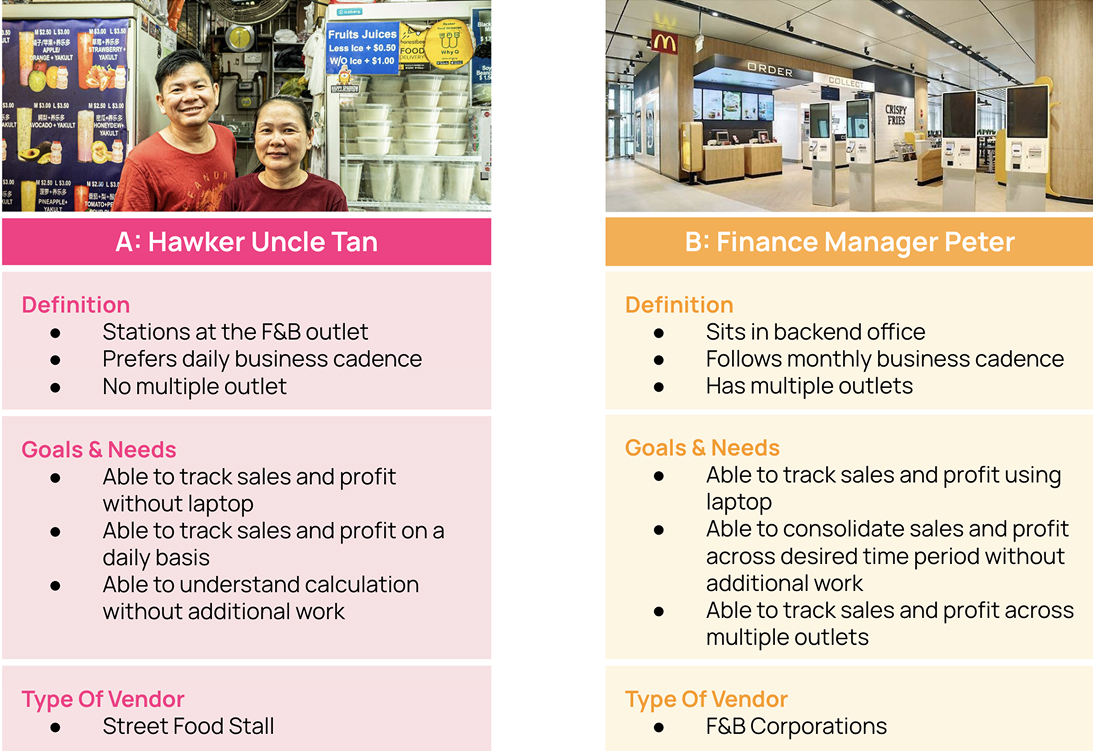
After conducting research, we identified distinct needs between street food stalls and F&B corporations. To prioritize the most critical problems and address the significant needs of key user groups, we created two personas representing these audience segments. This approach enables us to focus our efforts effectively.
I then proceeded to review the vendor journey, encompassing the order journey to success, while considering the frictions and needs identified from the two personas. This allowed me to distill the key insights from the vendor perspective.
Vendors want to see their earnings, understand sales figures & tally total easily
Vendors want to know deduction easily and confidently
Vendors want to receive the right payment amount on the right time
Rapidly adding core features to a product risk it becoming quickly fragmented. To make sure that the product stayed cohesive and that we were building the right things for our customers, I partnered with PM and Engineering leadership to align on 2 product principles that would underpin all future product development.
Numbers should consistently match across all vendor touchpoints, sourced from the same data.
All income sources, deductions, and fees should be fully visible to vendors, with accessible explanations and direct support when needed
It should be clear how numbers are calculated, why certain fees/charges appear, and what goes into a final payout
After presenting the insights to PMs, we established key metrics, in addition to the product vision, to define the success of the project. These metrics were aligned with our team's OKRs for the fourth quarter.
Improve vendor satisfaction by increasing the Payout CSAT score by 6%.
Reduce vendor reliance on Account Managers by decreasing the volume of support tickets related to payout.
Increase vendor engagement & stickiness with Payout by 5%.
To determine the most critical features for the initial release, we collaborated with Product Managers and the engineering team to revisit the User Story Map during a workshop. We utilized a simple T-Shirt scale for estimation and MoSCoW framework for prioritization.
Prior to brainstorming session, me and PM created a list of "How Might We... " questions to help us better align our user’s tasks and goals. We then spent 2-3 minutes brainstorming the solutions for each problem and replaying the process with a second round to come with as many solutions as possible.
After brainstorming, I created multiple design solutions, considering the pros and cons of each option. When making decisions, I took into account factors such as system complexity, team involvement, and, most importantly, alignment with our personas.

Dashboard exploration 1 - Contextual metrics

Dashboard exploration 2 - Metric Selection

Dashboard exploration 4 - Real time Est-Earning

Dashboard exploration 3 - Business Summary Customization

Financial exploration 1 - Comprehensive View: High-level metrics, Help, Payout Progress

Dashboard exploration 2 - Metric Selection

Dashboard exploration 4 - Real time Est-Earning
After extensive exploration, I presented multiple design concepts with recommendations for feedback from PMs.
After aligning with PMs, we conducted a design review workshop with Engineers for technical feedback and Sales Account Managers for user insights. User testing followed to identify friction points, ensuring refinements before launch.


Feedback from PM, Sale Account Manager and Engineers options
Based on workshop feedback and user testing findings, we made improvements considering technical constraints and personas prioritization. While chain vendors are crucial, we also considered the needs of small vendors.
Here are the key insights that I have narrowed down for iteration based on findings and feedback. I also revisited our product vision to ensure that the improved solutions align with our project goals, technical constraints, and the needs of our users.
Vendors juggle restaurant operations, so an overloaded Dashboard can be overwhelming
=> To simplify, I used a pop-over to explain Total Est. Earnings, providing quick clarity with an option to explore details on the report page.

Iteration on Dashboard Page: Displaying pop-over instead of Accordion
Key metrics like Gross Sales, Net Payout, and upcoming payout details must be clear and accessible for quick end-of-day reviews. Vendors also want a detailed cost breakdown without downloading invoices.
=> To improve navigation, the Finance Page now features a tab structure: Summary for business metrics, Payouts, and Statements. Vendors can easily view cost breakdowns and select date ranges for the Financial Summary.

Iteration on Finances page with dedicated tab: Summary, Payouts and Additional Statements
Knowing the upcoming payout amount is crucial, but vendors also express a need to track the progress and current stage of their payouts, considering the possibility of concurrent payouts.
=> In response, I have revised the approach for displaying information in the Upcoming payout card to address these scenarios and accommodate concurrent payout cycles. Furthermore, I have expanded the use cases to cover various payout cycles.

The iteration of Payout status - clear progress depends on different use cases
F&B Corporations require improved sorting options for monthly statements in addition to the payout cycle invoices (daily, weekly). They also need the ability to download or filter statements based on outlets and date ranges.
=> To address these needs, I have enhanced the Statements download feature by providing vendors with greater flexibility with Date and Outlet views,. Furthermore, I have implemented filter options to allow vendors to easily narrow down their choices.

The iteration on Statement documents download - provide more flexibility
This project marked my initial venture into designing a Dashboard and Financial features. It presented a multitude of challenges and opportunities in addressing longstanding critical issues within the platform. Among the most exciting aspects of this endeavor was making financial information and reports easily understandable and actionable. Considering the bustling nature of our vendors' restaurant businesses, the more streamlined and simplified the information we provide, the quicker they can complete their financial and reporting tasks.
Friction often arises between designers and developers due to the different tasks and perspectives on the same challenges. Effective communication and bridging any knowledge gaps are important for achieving better results. I've learned the importance of early conversations to minimize unexpected issues. This includes providing all design files and relevant documentation and organizing meetings with the right people to ensure synchronization.
In the real world, when dealing with complex systems and displaying information, there are numerous situations that deviate from the typical or expected usage patterns such as vendor with single vs multi outlet, daily vs monthly payout cycle, etc.... Working on this project has emphasized the importance of constantly questioning myself and considering potential issues or challenges that users may face during the design process. By doing so, I strive to anticipate and address these edge cases, ensuring that the design solution is robust and capable of accommodating a wide range of scenarios. This mindset enables me to create more inclusive and user-friendly designs that cater to the diverse needs of users in real-world situations.


How might we remove financial barriers for newcomers, enabling them to bank, build credit, and settle into life in the U.S. with ease?
*Case study coming soon ´{´◕ ◡ ◕`}

How can we facilitate secure ticket purchases, reduce fraud, and create seamless event experiences for Iraqi football fans while driving business growth and +30,000 tickets sold


